
Crochet kit color palette planning is the process of assigning every shade a job across a retail range. A useful palette helps customers understand the collection, gives each SKU a reason to exist and stays practical when yarn lots, photography and reorders introduce variation. It is range architecture, not simply choosing several attractive colors.
Define the range story in one sentence
Begin with the customer, selling moment and emotional direction. "Cheerful desk companions for first-time makers" is more useful than "bright colors." "Quiet botanical gifts for autumn" creates a different design boundary from "high-energy holiday ornaments." The sentence should be narrow enough to reject unsuitable shades but broad enough to support several projects.
Connect that story to channel conditions. An online thumbnail needs clear value contrast and recognizable shapes. A physical shelf may need packs that relate from several feet away. A subscription box may value a surprising accent, while an educational set may prioritize easy color identification. One palette does not perform identically in every context.
- Online: can customers distinguish variants at thumbnail size?
- Retail shelf: does the family read together from a distance?
- Gift channel: does the palette signal the intended occasion?
- Education: can users identify materials without relying on subtle hue differences?
Give each color a role
Instead of selecting ten equal colors, build a hierarchy. A hero color carries recognition. Supporting colors provide variety without competing. Neutrals create breathing space and make finished details readable. One or two accents add energy in small quantities. Functional colors may be required for eyes, outlines, skin tones, leaves or other project-specific elements.
| Role | Typical use | Approval question |
|---|---|---|
| Hero | Main body, background or dominant pack cue | Does it identify this family at a glance? |
| Support | Secondary forms and SKU differentiation | Does it strengthen rather than fragment the story? |
| Neutral | Balance, outlines and adaptable components | Does it preserve contrast under normal lighting? |
| Accent | Small high-attention details | Is the dose controlled in project and packaging? |
| Functional | Required representational detail | Can it be sourced consistently across reorders? |
Build families, not isolated SKUs
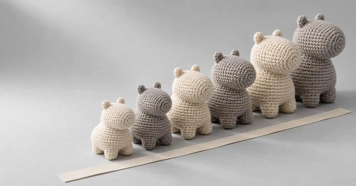
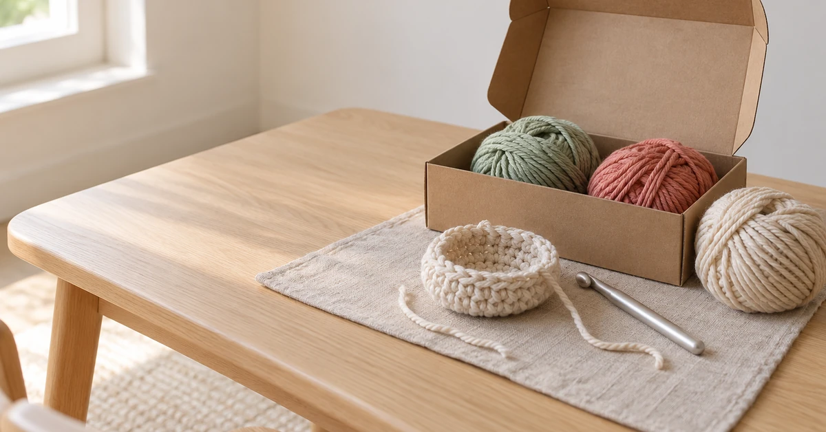
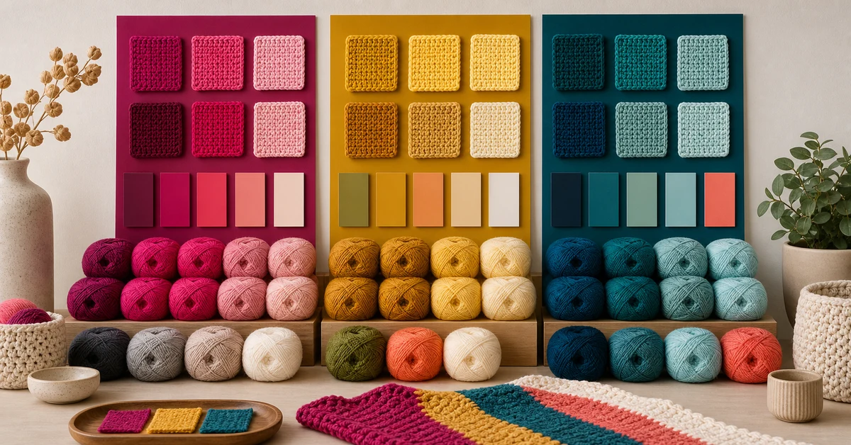
Lay every proposed kit side by side. A coherent collection often shares one or two anchor colors while rotating heroes and accents. This creates recognition without making all products look identical. For example, three botanical kits might share cream and leaf green, then use coral, mustard and berry as different hero colors.
Limit the number of new yarn shades introduced by each additional SKU. Every unique color creates another sampling, matching, inventory and substitution decision. Reusing a stable neutral across the range can simplify supply while giving the assortment a visual thread. Reuse should be intentional; forcing one shade into every design can also make the range feel mechanical.
- Place current and proposed products on one range board.
- Mark colors shared across two or more SKUs.
- Identify products with no visual connection to the collection.
- Remove shades that do not improve differentiation or usability.
- Record the role and consumption estimate for every approved color.
Test three retail viewing distances
The close view reveals yarn texture and subtle harmony. The arm's-length view shows the complete package and project photograph. The distant or thumbnail view shows only large blocks of color. Print pack mockups at approximate retail size and also reduce them to ecommerce thumbnail size. If all variants collapse into the same shape and value, customers may not perceive a choice.
Use grayscale previews to assess light-dark separation. Two hues can appear different in a color card but merge in instructions or finished details if their values are similar. This matters when a beginner must distinguish adjacent sections. Color vision differences and screen variation add further risk, so instructions should not rely on color alone; use labels, symbols or position as secondary cues.
Plan variants with a reason to exist
A variant should answer a distinct preference or occasion. Useful approaches include warm versus cool, calm versus energetic, everyday versus seasonal, or natural versus playful. Changing one random yarn ball rarely creates a convincing proposition. Name the difference internally, even if the words never appear on the pack, and confirm that the finished projects look distinct in photography.
Do not overextend the range before demand is known. A tight launch collection with clear choices is easier to read and replenish than many near-duplicates. Buyers can define a core palette, one controlled seasonal capsule and an exit rule for colors that do not earn a reorder. This connects design decisions to inventory discipline.
Stress-test sourcing and substitution
Ask which shades are standard, which are specially dyed and which have higher minimums or longer lead times. A beautiful range can become fragile if its identity depends on one difficult accent. For every critical color, decide whether substitution is prohibited, allowed within an approved tolerance or acceptable only after a new assembled sample is reviewed.
Compare production samples under consistent light and beside the approved yarn and finished object. Judge the palette as a group because small shifts can change the balance. Photograph the sample with a neutral reference, but retain physical standards. If the packaging uses printed yarn imagery, compare print, actual yarn and final project together rather than approving them in separate workflows.
Connect palette to pack and instructions
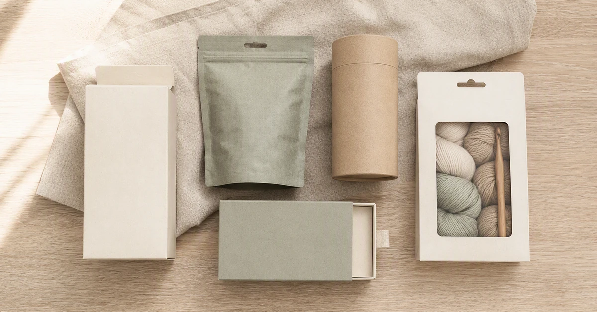
Packaging should amplify the hierarchy rather than introduce an unrelated color story. The hero color can guide the product image or a restrained pack element, while the background preserves contrast. Avoid allowing a bright packaging accent to suggest a yarn color that is not actually included. The front should make the finished outcome and variant distinction easy to recognize.
Inside the kit, organize similar shades so beginners can identify them. If two close colors are necessary, use separate bands, numbered positions or clearly differentiated labels. Instructions should be tested in print, not only on screen. The limitation is important: a strong palette can improve navigation, but it cannot compensate for poor component labeling or inaccurate photography.
Use a range scorecard
Score each proposal for story fit, SKU distinction, stitch readability, thumbnail impact, shared-color efficiency, lot risk and packaging alignment. A simple one-to-five scale forces the team to discuss tradeoffs. Add a written reason for any low score that is accepted. For example, a seasonal accent may carry sourcing risk but still justify a limited launch if the quantity and timing are controlled.
This disciplined form of crochet kit color palette planning produces an approval record: range board, color roles, physical standards, substitution rules, pack mockups and consumption estimates. Those materials help design, sourcing, quality and sales discuss the same collection rather than separate versions of it.
Hold a range-room review
Before approval, assemble production-representative yarn, finished samples, packs, instruction pages and ecommerce thumbnails in one place. Invite design, buying, quality and sales to review the same evidence. Give each person a short task: identify every variant, match each pack to its project, locate confusing close shades and name the weakest product in the family.
The review should end with explicit decisions, not general enthusiasm. Record what is approved, what requires a new physical sample and which risks are commercially accepted. Effective crochet kit color palette planning leaves a compact control file:
- One range board showing every SKU at the same scale.
- A role, yarn reference and consumption estimate for every shade.
- Physical standards and rules for substitute or seasonal colors.
- Approved pack mockups, thumbnails and printed instruction samples.
- A launch, reorder and exit status for each variant.
Where Onehourcrafts fits
The Onehourcrafts crochet DIY kit manufacturing page lists yarn color combinations, hook-set customization, private labeling and custom packaging among its OEM/ODM options. A buyer can therefore present a palette system alongside the component and packaging brief instead of sending disconnected color screenshots.
Use the crochet kit packaging guide to coordinate pack decisions, compare launch quantities with the MOQ guide, and connect assortment size to the craft kit inventory planning framework. When the board, target projects and volume assumptions are ready, submit them through the Onehourcrafts contact page for feasibility discussion and physical sampling.
Frequently asked questions
How many colors should a crochet kit range use?
There is no fixed number. Use enough shades to support the projects and create meaningful variants, then remove colors without a clear role. Shared anchors and controlled accents often produce a more coherent range than many independent palettes.
Should every SKU have a completely different palette?
No. Shared neutrals or supporting colors can create family recognition and simplify sourcing. Each SKU still needs a distinct hero, project or occasion so the customer can understand why the alternatives exist.
How should similar yarn colors be handled for beginners?
Test them in the actual stitch pattern and under ordinary light. If both are necessary, separate and label them clearly, and use symbols or positions in the instructions so completion does not depend on subtle color perception alone.
Can digital color codes replace physical yarn standards?
No. Screens and photography vary, while yarn texture changes perceived color. Digital references help communication, but final approval should include physical yarn, an assembled sample and agreed viewing conditions.
When should a seasonal color be discontinued?
Set the rule before launch using demand, remaining stock, reorder timing and whether the shade supports future products. A planned exit prevents a special color from becoming an unsupported long-term inventory commitment.