
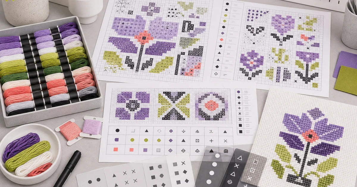
A cross stitch chart symbol design guide should assign marks that remain distinguishable at the printed grid size, connect clearly to thread colors and support navigation through dense pattern areas. Attractive artwork is not enough. Retail kits need chart symbols that target users can find, compare and follow without repeatedly losing their place.
Map the chart-reading tasks
List what users must do: locate the center, match a symbol to floss, count repeated cells, cross page boundaries, track completed areas and recognize special stitches. Different pattern sizes and skill levels create different navigation needs.
Identify high-risk zones such as confetti stitches, similar colors, large empty areas and symbols that appear only a few times. The chart system should make these decisions visible rather than relying on expert pattern-reading habits.
- Symbol-to-color lookup.
- Row and column counting.
- Page and section transitions.
- Completed-area tracking.
- Special stitch and outline recognition.
Create a symbol contrast library
Build a controlled set of geometric marks with different silhouettes, fill levels and orientations. Avoid assigning near-neighbors such as a small circle and slightly larger circle to adjacent colors. Differences should survive printing, photocopying and ordinary home lighting.
Review the symbols at final size, not enlarged on screen. Thin lines may disappear and dense marks may fill in. Keep a reserved set for backstitch or special instructions so those roles do not collide with regular color cells.
| Symbol pair | Risk | Better separation |
|---|---|---|
| Circle and filled circle | Fill closes at small size | Use a triangle or cross |
| Slash and backslash | Orientation is easy to reverse | Pair with a non-directional mark |
| Small square and diamond | Corners blur in print | Increase silhouette contrast |
| Dot and tiny cross | Both become visual noise | Use stronger line weight |
Assign symbols with color relationships in mind
Place the most distinct symbols on colors that are adjacent in the artwork or visually similar in floss. The legend should not require users to distinguish two close purple shades and two close symbols simultaneously. Use both code and physical organizer position where possible.
Keep symbol assignments stable across the chart, legend, organizer and digital support. If artwork revisions remove or add colors, run a full consistency check. Do not reuse a removed symbol for another color late in development without testing confusion.
- List all colors and special roles.
- Map which shades touch or appear together.
- Assign the strongest symbol contrast to risky pairs.
- Generate chart and legend from one controlled source.
- Verify every symbol after revisions.
Control grid scale and print quality
Choose a cell size that balances page count with readability. A compact chart can reduce paper but increase counting errors. Test the intended printer, paper, ink and finishing. Fold lines, binding and low-contrast backgrounds can obscure grid cells.
Inspect line weight separately from symbol weight. A heavy grid can compete with the marks; a weak grid can make counting difficult. Use stronger guide lines at practical intervals without relying on tiny printed numbers alone.
| Print check | Pass signal | Failure signal |
|---|---|---|
| Symbol edges | Silhouette remains clear | Lines break or fill in |
| Grid | Cells are countable | Grid dominates or disappears |
| Legend | Symbol and color code align | Marks differ from chart |
| Page fold | No active cells are hidden | Binding crosses detail |
Design page and section navigation
Large charts need stable overlap, coordinates or section markers. Show how neighboring pages connect and avoid splitting a complex motif without enough context. If the chart uses multiple pages, test the actual booklet order and fold.
Provide a clear center or starting reference where the project requires it. Users should be able to return after a break without recounting the entire design. Blank margin space can support notes and progress tracking.
Integrate special stitches and backstitch
Use a distinct visual layer for backstitch, French knots or fractional stitches. These marks should not cover regular symbols so heavily that the base color becomes unreadable. Provide a separate detail view when dense features require it.
Test whether users understand the order of work. If outlines are completed later, the chart and instructions should make that sequence clear. Use consistent line styles and terminology across all pages.
- Dedicated symbol or line family.
- Clear legend and sequence.
- Detail enlargement where needed.
- Unobstructed base-stitch information.
- Consistent instruction terminology.
Run a print stress test
Print the chart at final size on production-equivalent paper, then make lower-quality office copies and view it under different lighting. This reveals symbols that depend on ideal output. Check both black-and-white and color versions if either may reach customers.
Mark symbols that are misread or require repeated comparison. Replace the weakest pairs and repeat the print. A screen-only review cannot approve the physical chart.
Test navigation with target users
Give participants the chart, thread organizer and fabric. Ask them to find a set of specified cells, select the correct floss, stitch a small section and resume after a pause. Record lookup time, wrong choices, lost positions and questions.
This is where the cross stitch chart symbol design guide becomes a usability standard. Review dense and sparse zones separately. A symbol set that works in a simple border may fail inside a multi-color detail.
| Observed behavior | Likely cause | Response |
|---|---|---|
| Wrong floss selected | Legend or symbol pair is weak | Increase contrast and align organizer |
| User loses row | Grid navigation is insufficient | Add guide lines or section markers |
| Frequent zooming | Print scale is too small | Increase cell size or add detail page |
| Restart after pause fails | Progress tracking lacks anchors | Add stable coordinates and margins |
Freeze a controlled chart package
Keep the source artwork, color list, symbol library, legend, page layout and approved print proof under one revision. Automate consistency where possible, but visually inspect the exported files. A correct database does not prevent a clipping or font-substitution problem.
Trigger reapproval after color, symbol, grid, page size, paper, printer, organizer or instruction changes. Archive the exact customer PDF and printed master.
Check accessibility and localization boundaries
Do not assume that color alone will separate pattern areas. Review a grayscale print and simulated low-contrast viewing conditions where practical. Symbols should remain usable when adjacent thread shades appear similar. Larger print or digital zoom can support some users, but the standard printed chart still needs a workable baseline.
Keep symbol meaning independent from language wherever possible. Explanatory text, abbreviations and page-navigation labels may require localization, while geometric symbols can remain stable. If letters are used as symbols, confirm that they do not conflict with translated instruction abbreviations or resemble numbers at small scale.
Test digital files on common phones and tablets if the kit provides them. Zooming should not blur rasterized symbols or separate the chart from its legend. A downloadable version should preserve the correct page scale when printed. State whether customers may enlarge pages without changing the counted grid relationship.
Review how the chart works for users who mark progress with a pencil, highlighter, magnetic board or digital annotation. Symbols and grid lines should remain recognizable after reasonable marking. If the printed chart is double-sided, confirm that ink does not show through strongly enough to create false marks. Provide adequate margins so clips or holders do not cover active cells and legends.
Ask testers to use their normal tracking method rather than a development-team method. A chart that works only with one recommended accessory may create an undisclosed requirement. If a holder or magnet board is included, test its size, grip and interaction with folded pages as part of the complete kit.
- Grayscale and low-contrast symbol review.
- Minimum usable print and screen scale.
- Localization of legends and navigation.
- Digital zoom and export quality.
- Consistent symbols across all languages.
Where Onehourcrafts fits
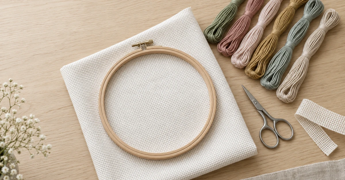
The Onehourcrafts cross stitch DIY kit page describes customizable patterns, fabric, threads, needles and packaging. Buyers can provide a cross stitch chart symbol design guide and approved print proof during sampling.
Coordinate chart work with the thread organizer guide, fabric count guide, needle size guide and quality checklist. Send the artwork, color list, chart format and user level through the contact page. Accessibility and market-specific requirements need separate review.
Frequently asked questions
Should chart symbols match thread colors visually?
No. Symbols should be distinguishable shapes. Color can support navigation, but users need a reliable chart when shades look similar or printing changes.
How many symbols can a chart use?
Use the number required by the artwork, but test the complete set at final size. Large palettes need stronger contrast and navigation support.
Are letters good cross stitch symbols?
They can work, but similar letterforms and localization may create confusion. Geometric marks often provide more controlled silhouettes.
Should charts be tested in black and white?
Yes when customers may print copies or color output is not guaranteed. Symbol meaning should not depend entirely on color.
When should chart readability be retested?
Retest after changes to artwork, colors, symbols, scale, grid, page layout, paper, printing, organizer or instruction sequence.